3/12
re-branding ⎯ [2025]
Espira

In collaboration with [Jonatan björklund] at academediaEspira is a Dutch preschool with a sustainable, Nordic and nature inspired concept.
Espira is a Norwegian preschool concept that has been introduced to the Netherlands. In order to adapt the concept to the Dutch market, adjustments were made, which created the need for a new visual identity.
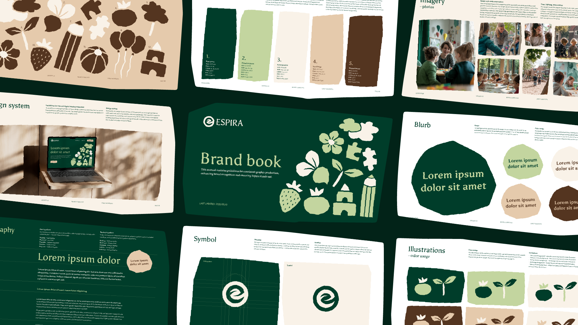
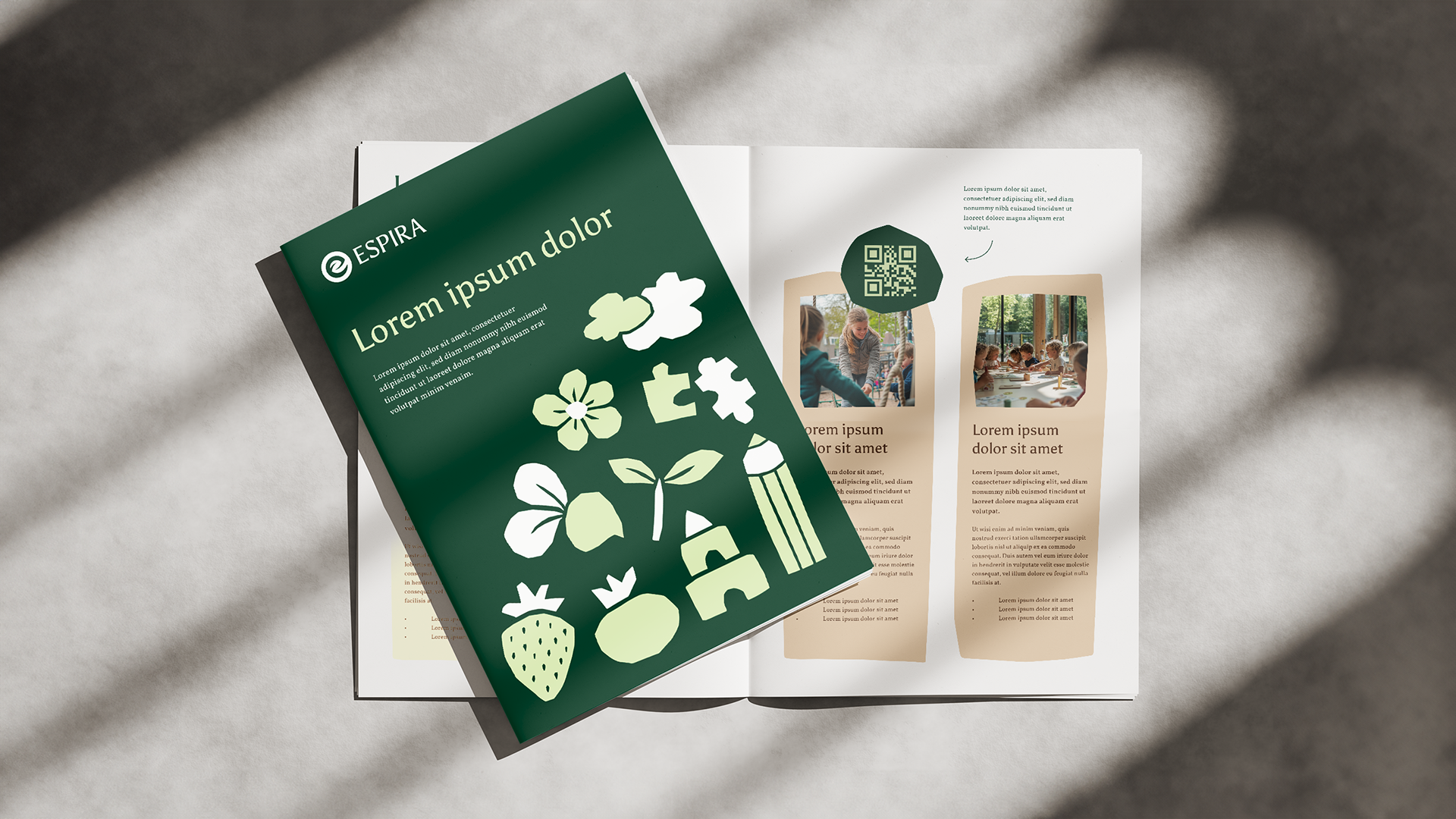
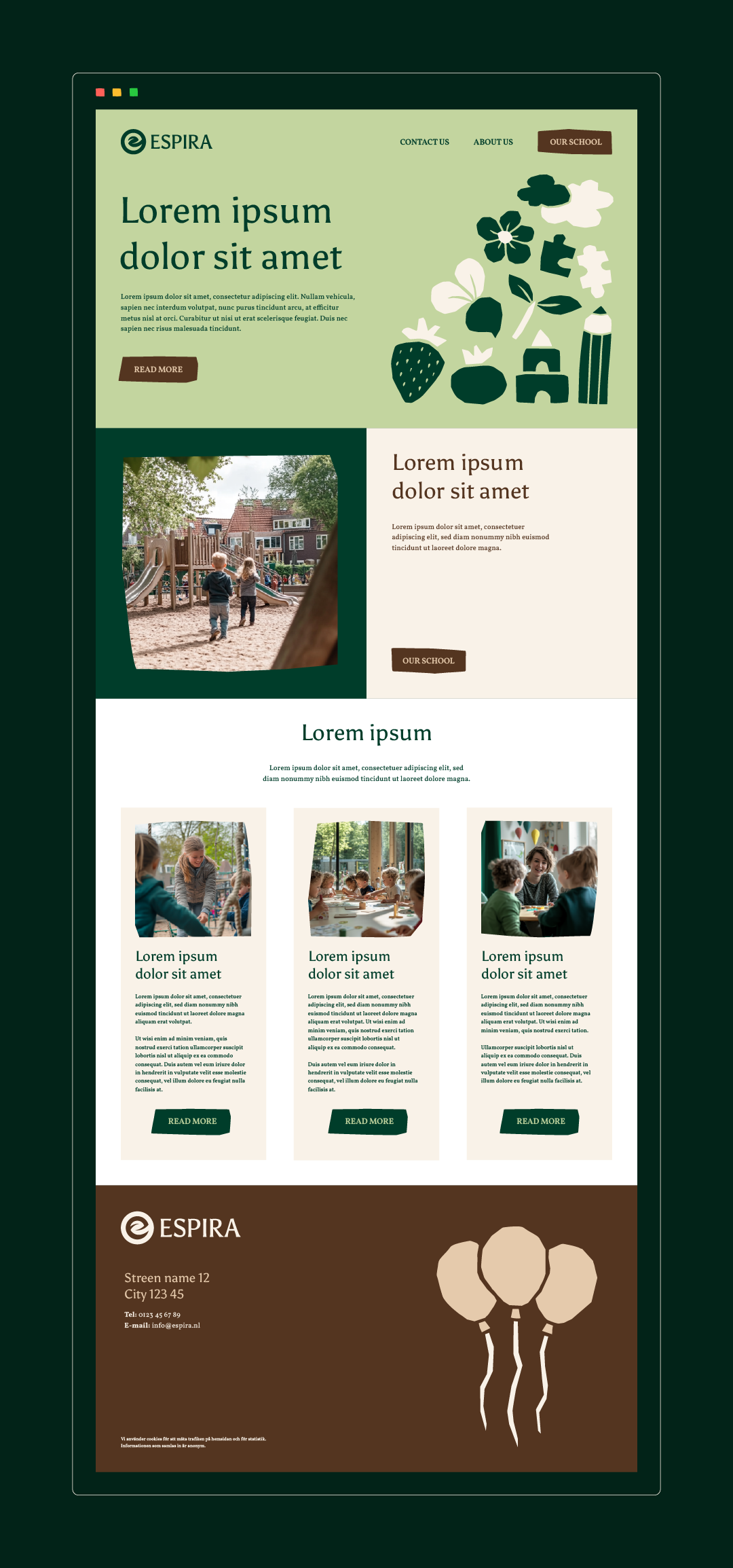
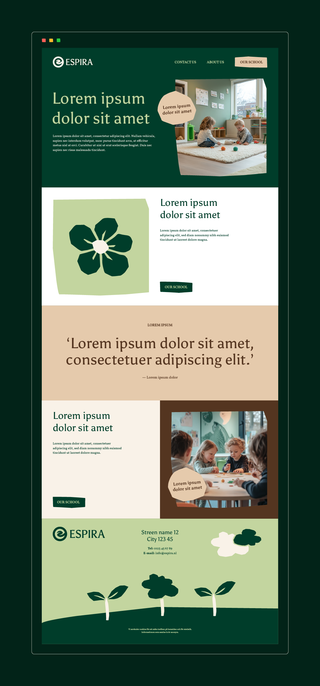
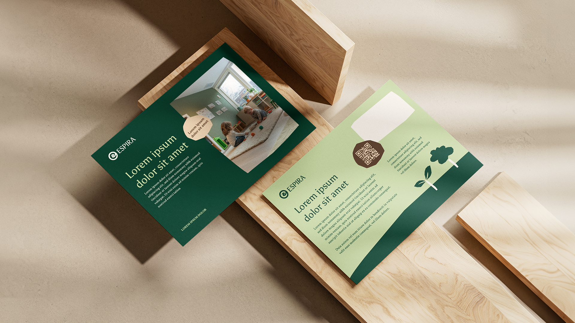
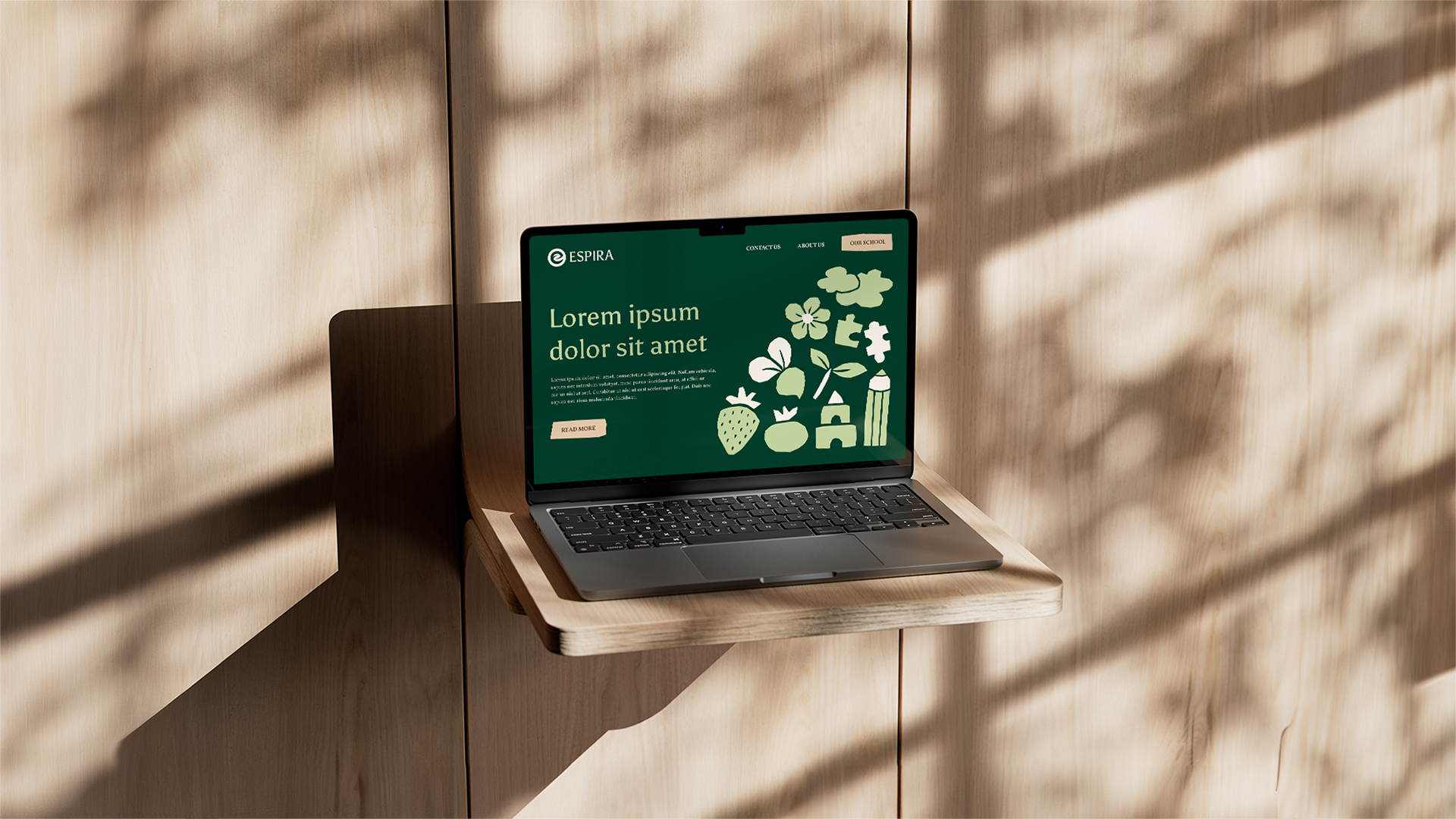
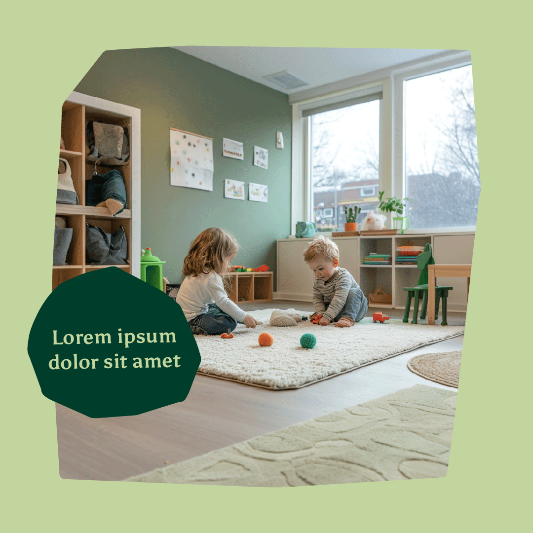
The preschool’s concept is inspired by Nordic lifestyle values, health, nature, and sustainability. At the beginning of the project, we established a design direction in which the brand should feel both professional and playful while reflecting the brand’s core values. The name Espira is associated with growth and sprouting, which also aligns with and further strengthens the brand’s concept.
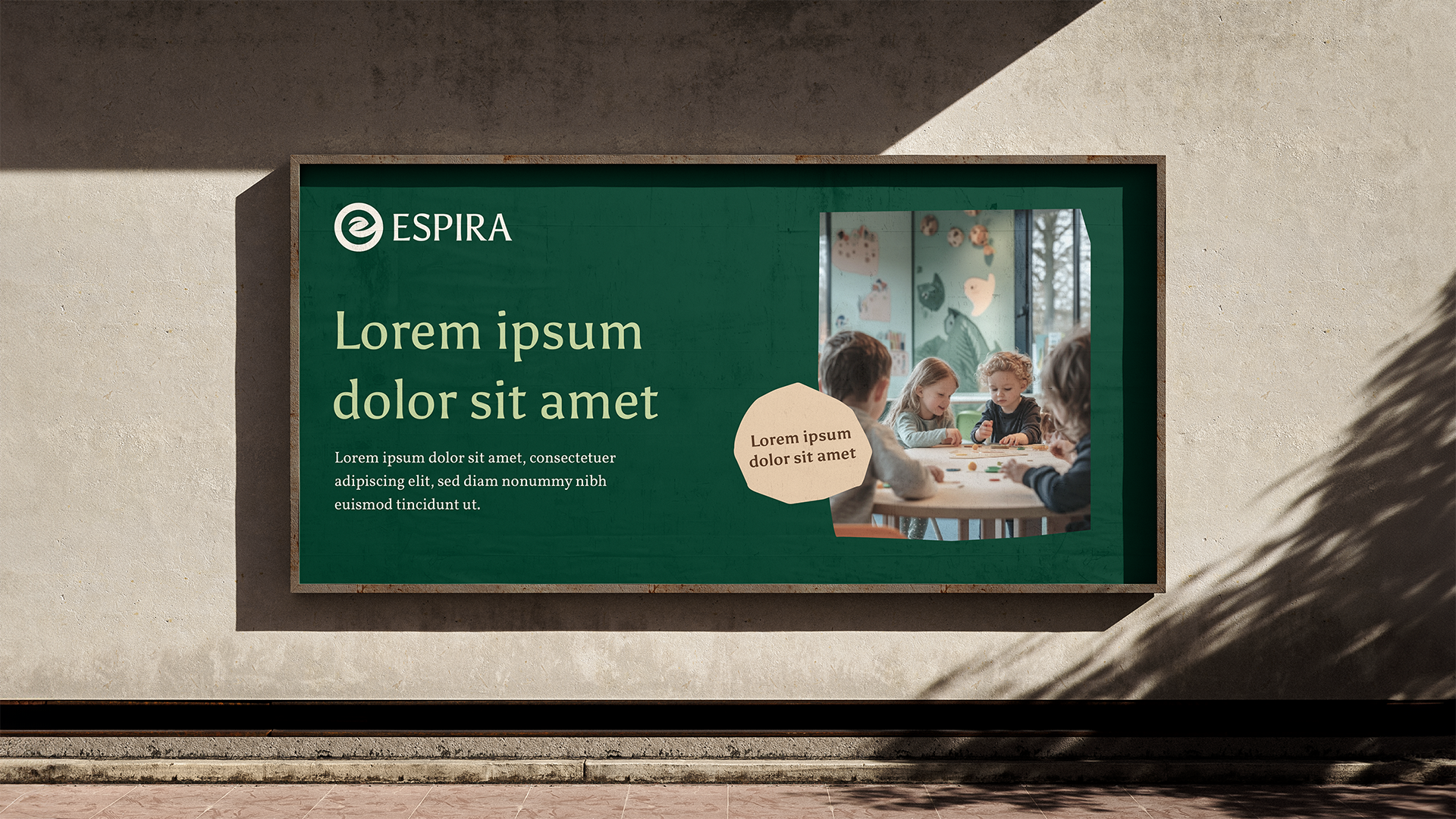
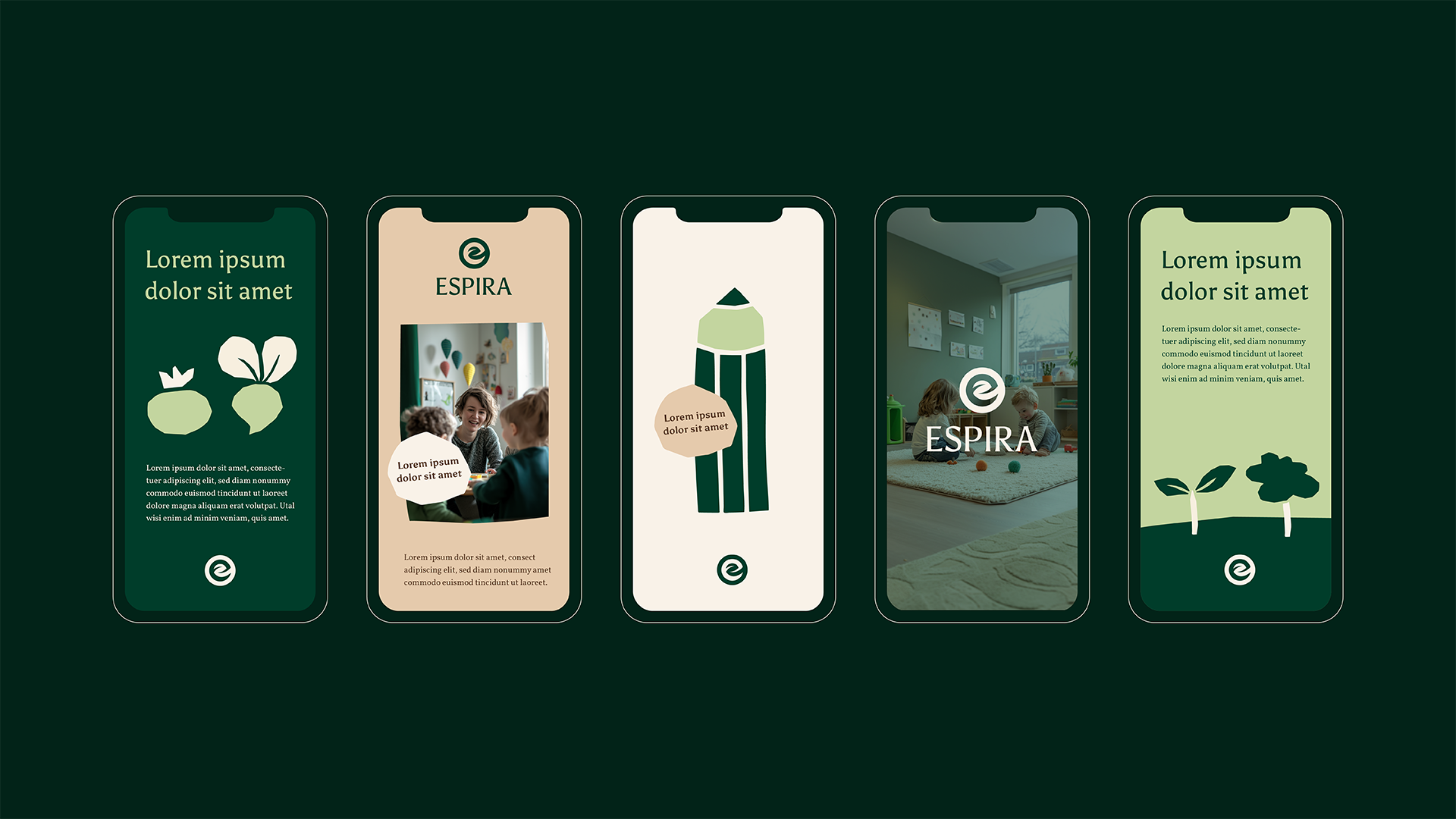
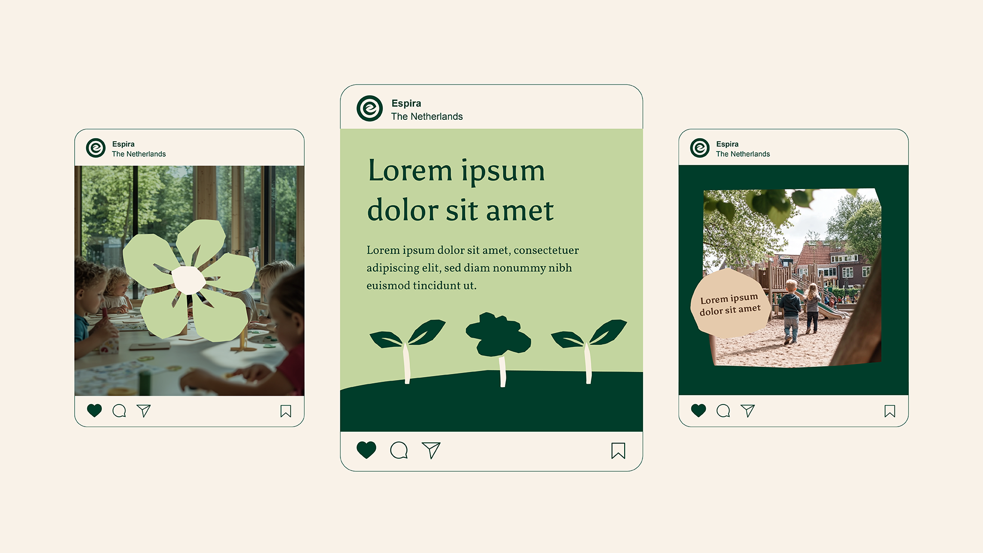
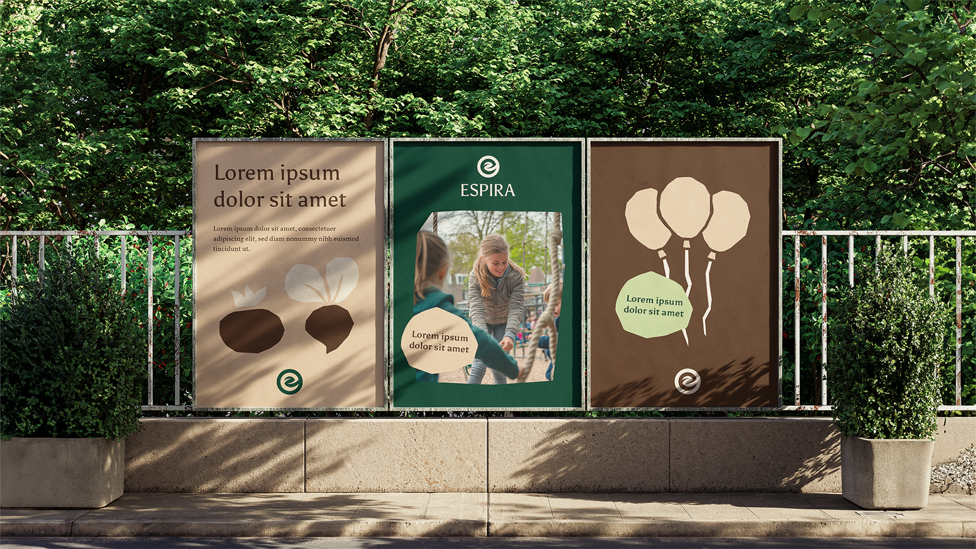
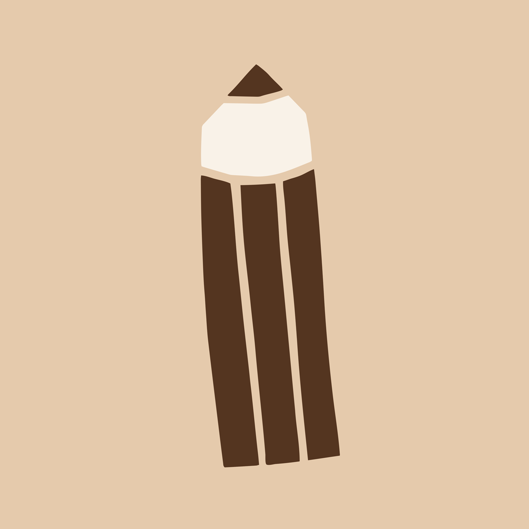
The outcome of the project is a visual identity built around earthy tones that balance a professional yet playful visual expression. The paper cut-out style was chosen to add playfulness to a mature colour palette and typography. The paper cut-out illustrations are created using an analogue technique: black paper pieces are cut and glued onto white paper, scanned, and then digitalised to form motifs that visualise the brand’s concept. The clean logo complements the paper cut-out elements, balancing their rugged edges and creating a harmonious overall brand style.